Your Catering Website Looks Fine on a Laptop. The Bride Booking You Is on a Phone in a Parking Lot
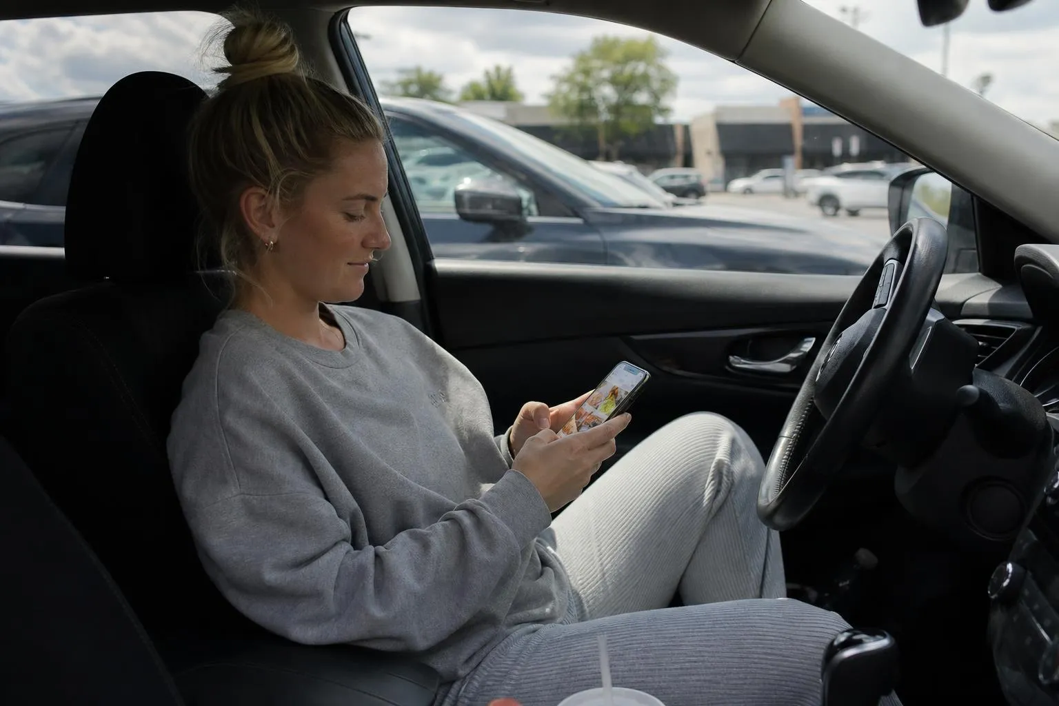
Friday, 11:20 a.m. A bride-to-be is sitting in her car outside her office, using her lunch break to shortlist caterers before her fiance’s parents fly in this weekend. She has four tabs open and a phone with 40% battery.
She is holding her phone in one hand and a half-eaten sandwich in the other. This is the exact moment your website was built for: the moment someone with a real budget and a real deadline goes looking for a caterer.
Here is what happens next, on searches like this one, dozens of times a week. She taps a result. The page takes its time loading. Half rendered, it is a desktop menu crammed onto a screen it was never designed for: tiny type, a navigation bar that will not open, a photo carousel stuck mid-fade. She pinches and zooms hunting for sample menus or a phone number. When she finds the number, it is baked into a logo image. It cannot be tapped.
Back button. Next result. Some other caterer gets the inquiry.
You and your clients have never seen the same website
Here is what makes this failure invisible: you and the people vetting you have never looked at the same site.
You saw it on a desktop monitor, the day the designer sent it over. It looked warm and appetizing. It still does, on that screen.
Your prospects meet it on a phone, almost always while comparing three or four caterers at once. Not relaxed at a kitchen table: on a lunch break, in a car, between meetings. The research puts numbers on how thin that patience is.
| Mobile reality | The number |
|---|---|
| Visitors gone if the page takes over 3 seconds to load | 53% (Google) |
| Conversion lost per extra second of load time | about 4.4% (Portent) |
| Rise in bounce probability from a 1-second load to 10 | 123% (Google) |
| Average mobile page load time | 8.6 seconds |
The average page takes 8.6 seconds; the patience window closes at 3. Most catering sites live on the wrong side of that gap, which is why page speed gets its own article later in this series.
So you see a warm, photogenic website and a quiet inbox, and never connect the two. There is no error message when an inquiry disappears. The site fails silently, again and again, in a version of itself you never open.
The comparison shoppers are the least patient visitors you have
For most businesses, a clunky mobile site loses a browser. For catering, it loses the buyer who was already comparing you against three competitors, tab by tab.
Your best leads (a wedding, a corporate holiday party, a 40-person office lunch account) arrive on a phone mid-comparison, one thumb-swipe from moving to the next tab. These are the highest-margin bookings you get, held by people with the least patience for a page that fights them. The couple planning a backyard barbecue might forgive your clunky site. The bride building a shortlist for a $6,000 reception will not. She needs to see your menu and pricing in the next ninety seconds, or she crosses you off before she ever calls.
The cruel math: the bigger the event, the higher the contract, and the faster a bad mobile site loses it. Even shops that cracked the Google local top three lose the inquiry when the page behind the ranking stumbles on a phone.
What “built for the parking-lot decision” actually means
A mobile-first catering site is not the desktop site shrunk down. It is designed for someone comparing you against three tabs, thumb only:
- Loads in a couple of seconds on a phone, on cellular, not just on your office router.
- A tappable inquiry button or phone number in the first screen. No scrolling, no hunting. Her budget, your form, one tap between them.
- The essentials above the fold: cuisine style, starting price per head, “serving [your city] since,” and proof: real event photos, review stars.
- Menus that render as text, not scanned PDFs, so she can actually read pricing without downloading anything.
- No decoration ahead of the inquiry. Autoplay video and stacked sliders cut in front of your only paying action and drag down your conversion rate.
None of this is exotic. It is simply a site designed around the person deciding, not the owner admiring it on a big monitor.
Can you just patch the site you have?
Rarely well, honestly. Here is the trade.
Patching the old site for mobile
- Cheapest move upfront: a responsive theme swap runs a few hundred dollars.
- You keep the branding and menu copy you already like.
- No rebuild project to run; live within a week.
Patching the old site for mobile
- The 8-second load usually survives the patch: the bloat causing it (page builders, hero video, uncompressed food photos) comes along for the ride.
- Tap targets, buried pricing, and the logo-as-phone-number rarely get rethought. The site shrinks; it does not adapt.
- You keep paying the invisible bill: at 53% abandonment, a patched-but-slow site still loses inquiries like the old one did.
A patch makes the site look mobile friendly in a screenshot. The bride comparing four caterers on her lunch break does not grade screenshots.
The test you can’t unsee
We opened this series with a blunt claim: your website is not broken, it is just not doing its job. Mobile is where that gets literal. The referral bookings in your calendar arrived despite this version of your site. The strangers it lost never left a trace.
Built for the person deciding on her lunch break
We build catering websites mobile-first: the parking-lot bride and the harried office manager are the design brief, and the desktop version is the adaptation. The inquiry form sits in the first screen, the page loads in about a second on cellular, and real event photos, per-person pricing, and reviews sit above the fold.
Watch the free video walkthrough of a live site on a phone screen, next to yours. The gap explains itself in about two minutes. Once mobile finally pulls its weight, marketing spend compounds instead of leaking; our ongoing growth services exist for that stage.
Frequently asked questions
What does a mobile-first catering website cost?
Our Standard build is $2399£1,899 one-time, and the Elite package is $7500£5,900 one-time, with pricing published on the get-website page. No contracts, you own everything, the site goes live within 7 days, and changes land within 24 hours.
Is a responsive theme the same as mobile-first?
No. Responsive means the layout reflows to fit a small screen; mobile-first means the phone version is the primary design. A responsive patch on a heavy site still loads in 7 to 9 seconds and still buries the inquiry form.
How many of my visitors are actually on phones?
For catering searches, the large majority. Open your analytics and check the devices report: bridal and event-inquiry pages typically show 75 to 90% mobile traffic.
Will fixing mobile help me rank on Google?
Yes. Google uses mobile-first indexing: it ranks the mobile version of your site, not the desktop one. Speed and usability feed the same local rankings that decide who shows up for “wedding caterer near me” on a Friday lunch break.
Next in this series: The trust tax: how an outdated catering website kills the referrals you already earned
Your move
Reading this does not book a job.
The owners who pull ahead are the ones who change one thing this week. If you want that one thing to be a website that sells and ads that put it in front of the right people, we build and run both for you.
Straight answer on whether we can help, usually the same day.